I have close to one hundred design magazines. Mostly Canadian House and Home or Style at Home. As I put stuff away and moved things around during my holiday decorating, I decided I needed to let them go. Take a quick flip through them, tear out what appealed to me and get rid of the rest.
So my jaw dropped when I read
this post on
decor8. But today when I flipped through the first issue, I gathered up the torn out pages and really looked at them. Examined them to see what drew me in, how I can incorporate some of that into my own home and what they had in common.
And I learned some interesting things and some obvious things.
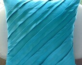
1. I'm drawn to the combination of teal/chocolate/white. Not so shocking since a large chunk of my home incorporates those colors.

2. Every image had natural wood paired with a modern or sleek finish. This one was a little new for me. I've not traditionally been drawn to wood finishes but I love the texture and depth they add to a room.

3. Every image had pops of vibrant color. Another unshocking one. This is a common theme in my decor and wardrobe.

Do you take the time to really examine what you like about an image? Do you hold on to old decor magazines (today's was from 2008!)?