Saturday, January 1, 2011
A Space of My Own
Photo source
I'm in love with the idea of this picture. A room that is decorated only for me and used only by me. A room to keep my work and craft and sewing.
Perhaps this is due to the fact that I am unlikely to have this for many more years. As the mother of 2 space is at a premium. I currently make do with a corner of the living room, a corner of the dining room and a hall closet to keep all of my things.
One day we will have a spare room I can claim, even if that day is in 18 years when both girls have moved out!! In the meantime I will dream and drool over pictures like the one above.
Tuesday, December 28, 2010
Etsy Taste Test
I love Etsy. But, honestly, I rarely go there unless I'm looking for something specific. And it almost always is for my children. Any time I've just gone to browse around I just get bogged down in how absolutely immense it is.
So when I read about Taste Test, I was intrigued. I've done it several times since then and every time it's new and interesting. And I've found quite a few intriguing shops.
Here is some of what it chose for me today.
So when I read about Taste Test, I was intrigued. I've done it several times since then and every time it's new and interesting. And I've found quite a few intriguing shops.
Here is some of what it chose for me today.
Monday, December 27, 2010
What Draws Me In
I have close to one hundred design magazines. Mostly Canadian House and Home or Style at Home. As I put stuff away and moved things around during my holiday decorating, I decided I needed to let them go. Take a quick flip through them, tear out what appealed to me and get rid of the rest.
So my jaw dropped when I read this post on decor8. But today when I flipped through the first issue, I gathered up the torn out pages and really looked at them. Examined them to see what drew me in, how I can incorporate some of that into my own home and what they had in common.
And I learned some interesting things and some obvious things.
1. I'm drawn to the combination of teal/chocolate/white. Not so shocking since a large chunk of my home incorporates those colors.
2. Every image had natural wood paired with a modern or sleek finish. This one was a little new for me. I've not traditionally been drawn to wood finishes but I love the texture and depth they add to a room.
3. Every image had pops of vibrant color. Another unshocking one. This is a common theme in my decor and wardrobe.
Do you take the time to really examine what you like about an image? Do you hold on to old decor magazines (today's was from 2008!)?
Tuesday, July 27, 2010
Around the web
Love the pile up of white on white texture and the grounding punch of black in this hallway found on Emma's site
I'm a big fan of furniture living multiple lives so this really appealed to me.
There are a ton of things I love in this craft space. In particular the carpet tiles on the wall and the breadbox as charging station.
I think bathrooms are a great place to go a little over the top. This before and after on Design Sponge is a great example.
Great tips I could have used last week.
Friday, July 16, 2010
Trend: Felt in Home Accessories
In the last week I've come across numerous different examples of felt pillows in home decor magazines.
The Layla pillow by Crate and Barrel
A felt loop cushion from UK store ASDA .
And a stunning colorful floral pillow found in House Beautiful magazine led me to the website of Ronel Jordaan and this cushion.
Then on a shopping trip I stumbled across a felt flower pillow at Winners.
And this doesn't even begin to cover all of the etsy sellers that sell felted goods. My favorite is Papaververt and her gorgeous felted bowls.
Obviously I am a fan of the felt trend and am even trying my hand at replicating a felted pillow for my sofa. What do you think of felt in home decor? Love it or feel it's best left for children's crafts?
Saturday, June 26, 2010
Shopping Finds
I've had a few interesting finds while out and about shopping in the last few weeks and wanted to share them.
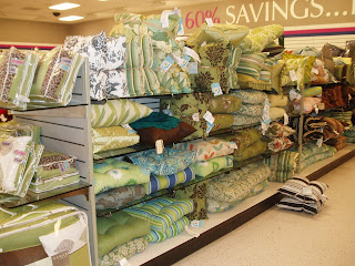
At Winners the theme was definitely green in home decor, with up to date patterns and materials. So pretty I was wishing I had spots for them in my home.
A follow up trip uncovered 2 sets of chairs that called out to me.
The find that was most surprising to me was a line of office storage at Walmart. I stumbled upon them while shopping for envelopes but ended up returning for a two-drawer storage unit and a canvas storage box.
Wicker Emporium had a really pretty blue tufted chair.
A little exploration on their website and I discovered that it is also available in green and orange.
Monday, June 21, 2010
Magazines: In Hand or Online?
I love magazines.
It is one of my major vices. On any given day you can find a stack of magazines at least 10 high waiting to be read. I love pretty much all of them. Gossip, fitness, parenting, craft and of course home decor. But over the last several years magazine after magazine has gone under. Domino, Elle Decor, Blueprint, O at Home, House and Garden all in the last two years. It seemed to be a sad scene for home decor magazines. Worry abounded that other favorites would be soon to follow. Instead the remaining magazines seemed to have stepped up their game in response. Style at Home and House Beautiful stand out to me as magazines that have done nothing but improved over the last two years and I love settling into my sofa for a few hours on the weekend to pore over the latest issues.
In addition, the online magazine scene has started to expand. It started with the Domino spinoff Lonny I've read a few issues and LOVED the content. Now there is Nesting Newbies I haven't had the opportunity to flip through this one yet but it got good reviews overall from Apartment Therapy As well, several paper magazines have online versions available, Style at Home and House and Home, to mention a few.
When you combine online magazines with the plethora of design blogs and the popularity of Flickr, it's easy to find inspiration with a few keystrokes. And because of the long turnaround time magazines experience (they are working on Christmas issues in the middle of summer) I often find myself noting month old trends on the "new and newsworthy" pages. As a quick example, the May issue of House Beautiful listed subway scrolls as a noteworthy trend while Apartment Therapy readers dismissed the trend as over and done with in February 2010.
But I haven't been able to fully commit to online magazines. Every month I think I will explore the latest Lonny but I rarely get around to doing it. Part of it is because I spend a ton of time on the computer and have a hard time sitting down and committing to reading a whole magazine on the screen. Part of it is that I love curling up and flipping through pages, tearing out the ones that really inspire me. I'm sure that I will eventually begin to explore more of the online content but for now, I really hope that my favorite magazines continue to publish paper copies each month.
Subscribe to:
Posts (Atom)